
You know your business has a real personality. Your website doesn’t show it. Maybe you’ve been meaning to “update” it, but you’re not sure where to start or what’s even possible.
That was Regina when she came to me, and it’s a fixable problem. The short version of what I’d tell anyone in her spot: your website should sound like you on your best day.

Who Regina is
Regina is a coach for late-diagnosed neurodivergent adults. Her story is vivid and specific. She spent most of her life thinking she was broken, got an AuDHD diagnosis at basically 50, and now helps other late-diagnosed folks find their footing, the way she finally did. She also has a Ph.D. built on studying role-playing games and identity. Her voice is funny, raw, and completely her own.
None of that was on her website. What she had was a one-page, generic, forgettable landing page. She came to me with a vague feeling and an even vaguer request to “update” it.
Picture what a visitor actually got from that page. Her name, a short generic description of coaching, and one way to respond. No story. No mention of the diagnosis that changed her life at 50, the Ph.D., or the humor that makes people trust her within five minutes of a call. If you landed on that page knowing nothing about Regina, you left knowing nothing about Regina. The page wasn’t broken. It was empty of the one thing her business runs on: her.
Why boring was a problem
For some businesses, a plain website is fine. If you’re a plumber, nobody needs your pipes to have personality.
Regina’s business is her personality. I think people choose her because they read her words and think, “she gets it, she’s been where I am.” Her site was the first impression, and it wasn’t saying anything about her. Someone who left that page never met the real Regina.
What I rebuilt
This wasn’t a tune-up. It was a full rebuild, from a single landing page to a multipage site with a real blog.
I consolidated the homepage and about page into one strong page. That was a deliberate SEO call: instead of splitting her authority across two thin pages, everything now points at one page that deserves to rank. I also added a lot more text throughout. It’s real substance, not filler, because Google can’t rank what isn’t there.
Here’s what that actually turned into:
- One strong homepage that carries her story and her background together, instead of two thin pages splitting the same authority
- A Services page with room for each of her programs to be explained properly
- A real blog, her Essays, because for a coach whose ideas are the marketing, publishing space is not a luxury
- A Podcast page and a Contact page, with her booking link within reach from everywhere on the site
- More than one way in: read something, hear her voice, book a call, instead of the single path the old page offered
The new structure gave her more pages, more information, and better bones for search. It also gave visitors more ways to take the next step. The old page had basically one path. The new site has several, and they bring people into her funnel instead of letting them drift away.
Once Regina gave me her notes on how she wanted the design to feel, I had it done in a few weeks. The fastest projects are the ones where the owner tells me who they are. I can’t design your personality for you, but if you hand it to me, I can build the site around it. (I’d be even faster now. I’ve picked up better techniques since that build.)
Get more of this in your inbox
I send a short, practical newsletter for small business owners. Website tips, content ideas, no guru energy.
What I can and can’t tell you yet
I don’t have traffic numbers to show you. The site is still young, and I’m not going to invent a success metric.
Regina did tell me something better than numbers. She said she likes her blog page so much it makes her want to write more blogs. Her old site was something she avoided. Her new one makes her want to create. That’s the difference between a site that’s a chore and a site that’s an asset.
When I sent Regina the draft of this very post and asked if she was comfortable with all of it, she wrote back: “So glad to help you after you helped me so much!” That’s the result I’ll take over a traffic graph this early: a client who wants to help tell the story because the work actually helped her.
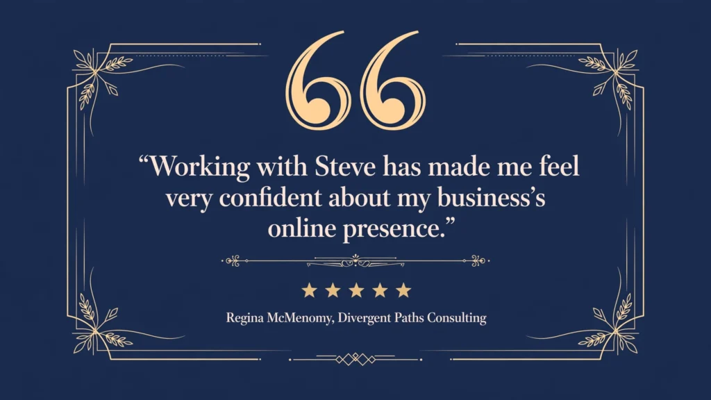
She also left me a five-star Google review that I keep rereading: “He helped me update my outdated website, added so many great features to it, got it noticed on Google, and is helping me grow my social media presence… Working with Steve has made me feel very confident about my business’s online presence.”
One thing to try
Your website should sound like you, not like a template, and not like every other coach, consultant, or creative with the same three stock photos.
Take a hard look at your homepage and ask: would a stranger meet me here, or a placeholder? If it’s a placeholder, send me your website address. I’ll take a look and tell you straight what I’d change.
 Steve runs Side Quest Solutions in Bristol, Connecticut, where he helps small businesses turn overwhelmed websites into ones that bring in work. Every client he’s ever had came by referral, and he writes like it.